Versión en español aquí
To directly explore the tropidurinae morphospace I created go here

After reading the newest paper by Pianka et al (2017), which basically summarizes ecological data collected for lizards across entire lifetimes of field work (Pianka’s and Vitt’s, specifically) I got inspired by the interactive way they showed (in the supplemental materials) the “niche hypervolumes” created for their lizards.
These niche hypervolumes represent, in short, a 3-dimensional map in which any given point in space is linked with several ecological and morphological variables. In this context one can identify the characteristics of a given species as far as its location in the volume is known. This could also work backwards, as you could hypothesize the existence of a species with a particular set of ecological characteristics when the space it should occupy in the map is empty, just as in a periodic table of elements.
Anyways, the great complexity of these hypervolumes required not only a 2D representation to be understood but also various sets of interactive plots, which you can explore in Pianka’s page following the link in his paper.
I never thought before of doing this kind of interactive representation but it might prove quite useful even for my less-impressive morphological data on Tropidurines. In a previous post, as well as in the original paper, I represented the morphological variability of these lizards showing a scatterplot of the two first principal components (PC1 and PC2):

Together, these two PCs explain about 68% of the total variability of my data. The next PC in terms of importance is PC3, which explains 9.2%. Not a lot, but including it could give a different perspective on how we understand these results.
After making an interactive 3D plot (I used plot.ly) you can observe the data and explore it from different angles. This is how it looks like when you see it from the same perspective as in the paper:
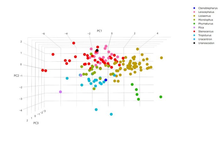 Genera are represented with different colors and values in the axes are different because of scaling reasons, but you should notice that species (individual dots) occupy proportionally the same space in both figures.
With the interactive plot, however, you can now explore the relationship between other pairs of axes like PC2 and PC3:
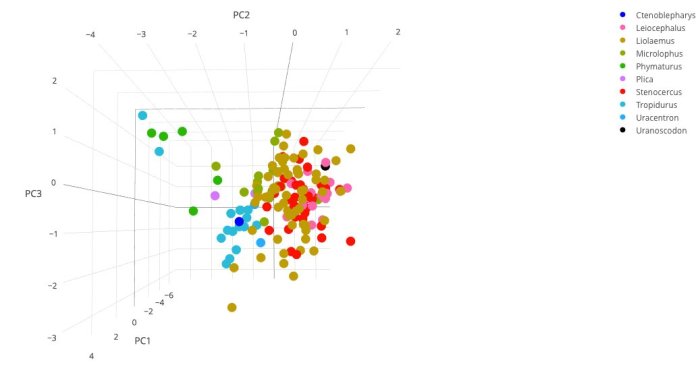
PC3 in this case is strongly and negatively related to head width and height, and strongly and positively related with traits of the limbs. One could start hypothesizing that most genera have species occupying large extensions of this axis because of different diets (which need different head morphologies) and different strategies of locomotion (related to the limbs). Notice, however, how Phymaturus species (green dots in the upper-left corner) tend to be isolated from the rest, suggesting a restricted morphology within the genus.
You can also explore species in the space formed by PC1 and PC3 :

Perhaps the most interesting thing will be to explore this by yourself. The reason is that you will notice how species of the same genera are packed in a given volume, not just area as showed in the figures. The 3-dimensional view of the points will give you a better idea of how morphologies tend, in this particular case, to be restrained by factors related to evolutionary history, and also how this morphologies are relatively well differentiated between them.
Unfortunately I haven’t find the way to put the interactive plot here yet (apparently I would need a “business” wordpress acount!!) but you can freely access to the plot clicking here.
Believe me, it’s a thousand times better than the figures I just showed you. Just grab the figure and move it as you wish. So if you want give it a try and play with it!
References:
-Pianka, E. R., Vitt, L. J., Pelegrin, N., Fitzgerald, D. B., & Winemiller, K. O. (2017). Toward a Periodic Table of Niches, or Exploring the Lizard Niche Hypervolume. The American Naturalist, 190(5), 000-000.
-Toyama, K. S. (2017). Interaction Between Morphology and Habitat Use: A Large-Scale Approach in Tropidurinae Lizards. Breviora, 554(1), 1-20.
Explorando el espacio morfológico de los Tropidurinae con plots interactivos
Para explorar directamente el morpho-espacio que preparé anda aquí
Después de leer el más reciente paper de Pianka y colaboradores (2017), el cual básicamente resume información ecológica de lagartijas colectada a lo largo de vidas enteras de trabajo de campo (específicamente las vidas de Pianka y Vitt) fui inspirado por la forma interactiva en que los autores mostraron (como material suplementario) los “hipervolúmenes de nichos” que crearon para sus lagartos.
Estos hipervolúmenes representan, en corto, un mapa tridimensional en el que un punto dado en el espacio está relacionado con muchas variables ecológicas y morfológicas. En este contexto uno puede identificar las características de una especie siempre y cuando se sepa su localización en el volumen. Esto también podría trabajar de forma inversa, ya que uno podría intuir la existencia de una especie con un paquete particular de características ecológicas si es que el espacio que dicha especie debería ocupar en el mapa estuviera vacío, tal y como funciona una tabla periódica de elementos.
La gran complejidad de estos hipervolumes requirió no solo una representación en 2d, sino varias gráficas interactivas, las cuales puedes explorar en la página de Pianka siguiendo los links en su paper.
Nunca pensé hacer este tipo de representación interactiva pero podría ser bastante útil para mi menos-impresionante data morfológica de tropidurines. En un post previo, así como en el paper original, representé la variabilidad de estas lagartijas mostrando un scatterplot de los dos primeros componentes principales (PC1 y PC2):
Juntos, estos dos PCs explican aproximadamente el 68% de la variación total de mis datos. El siguiente PC en términos de importancia es el PC3, el cual explica el 9.2%. No es mucho, pero incluirlo podría darnos una perspectiva diferente para entender estos resultados.
Después de hacer un plot interactivo (usé plot.ly) uno puede ver los datos de los tres PCs y explorarlos desde diferentes ángulos. Así es como se ven los datos cuando los miras desde la misma perspectiva en que se muestran en el paper:
Los géneros están representados con diferentes colores y los valores de los ejes son diferentes debido a motivos de escala, pero deberías notar que las especies (puntos individuales) ocupan proporcionalmente el mismo lugar en ambas figuras.
Sin embargo, con el plot interactivo puedes ahora explorar las relaciones entre otros pares de ejes, como PC2 y PC3:
En este caso PC3 está fuerte- y negativamente relacionado con el ancho y alto de cabeza, y fuerte- y positivamente relacionado con características de las extremidades. Uno podría empezar a pensar que la mayoría de géneros ocupan largas extensiones de este eje debido a que incluyen especies con diferentes dietas (las cuales necesitan diferentes morfologías craneales) y diferentes estrategias de locomoción (relacionada con las extremidades). Sin embargo se puede notar cómo las especies del género Phymaturus (puntos verdes en la esquina superior izquierda) tienden a estar aisladas del resto, sugiriendo una morfología restringida dentro del género.
También puedes explorar especies en el espacio formado por PC1 y PC3:
Tal vez lo más interesante sea explorar esto por tu cuenta. La razón es que notarás cómo las especies del mismo género están empaquetadas en un volumen determinado, no solo una área como se muestra en las figuras. La vista tridimensional de los puntos te dará una mejor idea de cómo las morfología tienden, en este caso particular, a estar limitadas por factores relacionados a la historia evolutiva de cada género, y también cómo estas morfologías están relativamente bien diferenciadas entre sí.
Desafortunadamente no he encontrado la manera de poner el plot interactivo aquí todavía (aparentemente necesitaría una cuenta “premium” de wordpress!!) pero puedes acceder a él haciendo click aquí
Créeme, es mil veces mejor que las figuras que muestro más arriba. Solo toma el gráfico y muévelo como desees. Así que si quieres, pruébalo y juega un poco con él!
Referencias:
-Pianka, E. R., Vitt, L. J., Pelegrin, N., Fitzgerald, D. B., & Winemiller, K. O. (2017). Toward a Periodic Table of Niches, or Exploring the Lizard Niche Hypervolume. The American Naturalist, 190(5), 000-000.
-Toyama, K. S. (2017). Interaction Between Morphology and Habitat Use: A Large-Scale Approach in Tropidurinae Lizards. Breviora, 554(1), 1-20.


Hola Ken, muy interesante tu análisis tridimensional del morfoespacio en Tropidúridos. Encontré tu blog de casualidad y me alegró mucho ver que el trabajo sobre tablas periódicas haya sido inspirador para abordar los espacios multidimensionales en forma interactiva. Justo en este momento estamos realizando nuevos análisis sobre la base que usamos para la tabla periódica, explorando más en detalle y cuantificando los hypervolúmenes de nicho.
No pude acceder al material suplementario de tu trabajo en Breviora y me quedé con la curiosidad de saber las especies incluidas en tu análisis. Me podrías pasar un pdf de este material?
Muchas gracias y suerte en tu doctorado!
LikeLike
Hola Nicolás, te dejo un link de donde puedes descargar el pdf:
https://www.researchgate.net/publication/317175582_Supplemental_Materials_-_Breviora_554
Dime si logras descargarlo, si no se puede te lo puedo enviar directamente.
LikeLike